Let me get straight to the point. In this post, I’m going to share some tricks on creating responsive feature comparison tables in Genesis. This is not a Genesis-only tutorial; the code snippets will work pretty much on any WordPress site.
While there are many tutorials on creating pricing tables in Genesis, there are very few (almost none) tutorials on creating responsive product comparison table in Genesis.
After doing research, however, I have been able to three different approaches to creating responsive tables for a feature comparison table.
Use Case:
So where exactly does a responsive feature comparison table come into the picture?
Let’s pretend we are creating a smartphone reviews website where we need to compare several smartphone models for our visitors so they can compare the features and make an informed purchase.
Agree we can create a simple comparison table using simple HTML and CSS, but what about making it responsive for mobile devices?
This is exactly where things start to get a tad bit complicated, right?
Okay, time to sound a little less dramatic and get down to the coding business, yes?
Show Me the Code, Dude!
In order to create responsive tables for feature comparison, you will need the following:
#1: HTML for creating table
#2: Using CSS to jazz it up a bit (and suit your own design)
#3: Using script to manipulate data inside the cells (super important)
I have found three different ways to accomplish this, although there could be many others (I’m pretty much certain there are).
Each of the following solutions is designed in a unique way as far as the responsive table are concerned. Hopefully, you might find one of these suitable for your project.
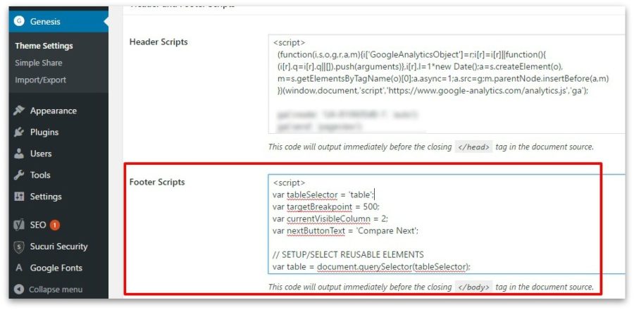
There are a couple of things you should know upfront though. Solution #1 can be achieved without any scripts while Solution #2 and #3 will require scripts to be used before the body tag. If you’re using Genesis child theme, here’s a screenshot of the location where you should paste the script provided in Solution #2 and #2.
Solution #1: Sample HTML, CSS and Script
Script: No script required for this solution.
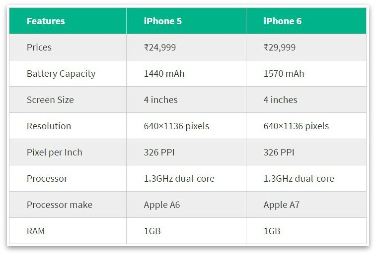
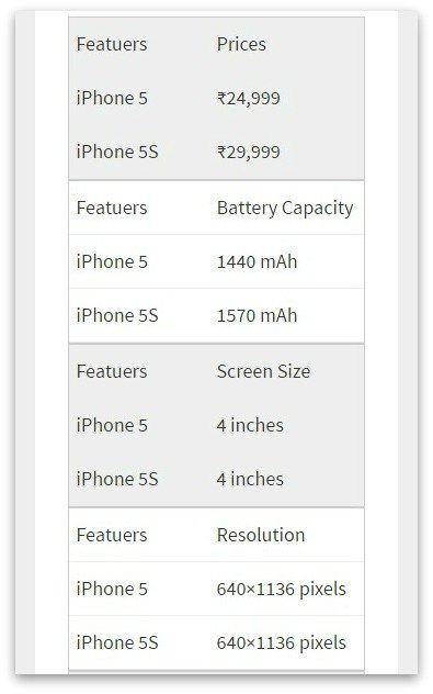
If you’re curious, here are the screenshots of Solution #1:
Solution #2:Sample HTML and CSS
For the curious mind, here are the screenshots of Solution #2:
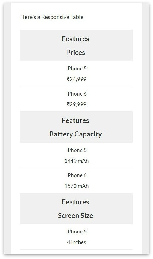
Solution #3:Sample HTML and Script
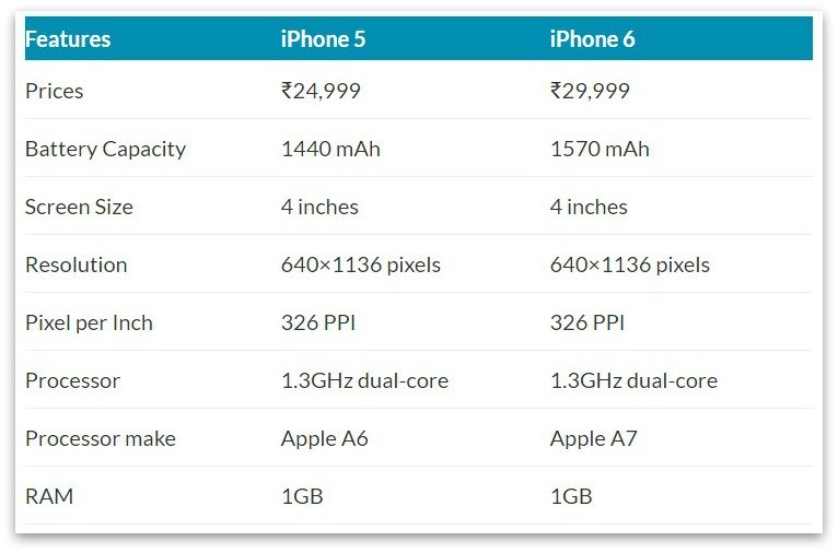
Here are the screenshots of Solution #3:
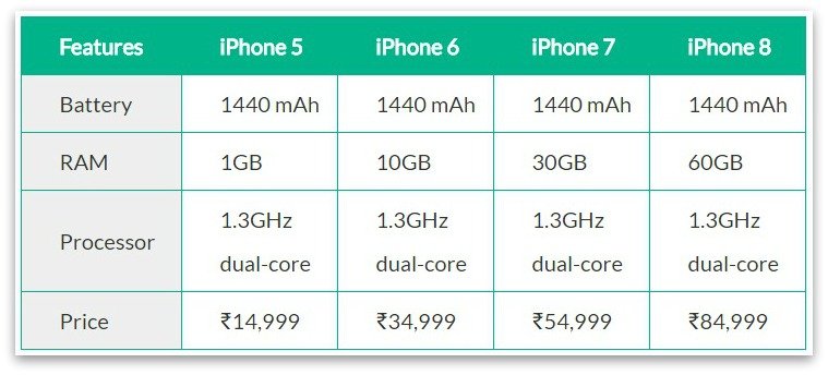
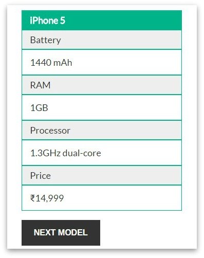
Credits: Garrett | James | Dave
Which one do you like the most? Let me know in the comments below.


/*
Label the data
*/
td:nth-of-type(1):before { content: “Featuers”; }
td:nth-of-type(2):before { content: “iPhone 5”; }
td:nth-of-type(3):before { content: “iPhone 5S”; …………………..
————————————————————————————————————————————————————
1. Why the above is needed, does it mean I have to mention all table header names in CSS?
2. https://i.imgur.com/8U43rnn.png ?
3. Will the following script work with your script (for PC)? or do you have a better script? http://www.javascriptkit.com/script/script2/sorttable/index.shtml