


Vertical CSS Timeline is essentially a design pattern to showcase events, milestones and processes in a chronological fashion to infuse simplicity into storytelling. While it’s not new to the web design world, web designers have started using it more and more over the past few years to create better user experience.
From instant messaging applications to about us pages, vertical css timeline are being used for better design and interface. A vertical CSS timeline can be created in many ways. Here are some great examples of CSS timeline if you’re interested.
In this guide, I will tell you how to create a vertical css timeline in Genesis Framework.
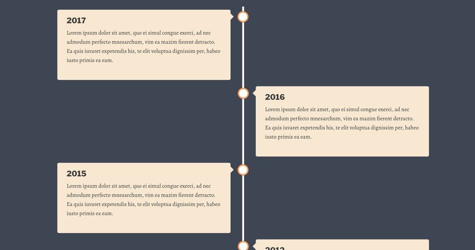
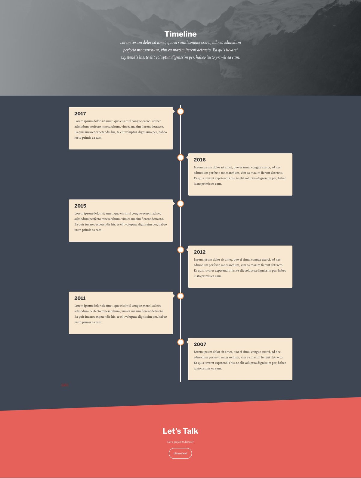
Before we start, let me share a screenshot of the timeline that we’re going to create in this guide. For this guide, we want to create a timeline in our about us page to showcase milestones of our company. You can use it to showcase just about anything – the process remains the same.

Steps to Create CSS Timeline
Step #1 — Create a Custom Body Class
Step #2 — Use HTML Markup in Your Content
Step #3 — Add CSS Snippets for Timeline
Step #4 — Customize CSS for Media Queries
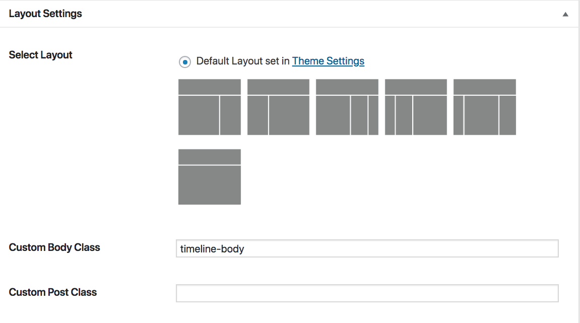
Create a Custom Body Class
We’re going to create a custom body class so we can use a different background color, page-width and other necessary HTML markups for the timeline page.
To do this, simply open the page where you want to create the timeline. Under the layout settings, you should see Custom Body Class. Simply enter a unique class name. For example, for this guide, our body class name is “timeline-body”. You can give any name as per your liking. Note: Make sure it doesn’t clash with any other classes you’re already using in your theme.

Use HTML Markup in Your Content
That’s right! We’re going to use some HTML markup in our content. If you want to test it out, simply copy the text below. It contains the markup as well as the classes we will use in creating the timeline design. Note: Again, make sure the class names you use don’t clash with any existing classes in your theme.
As you can see, we have created some div elements which include class names such as timeline, container, box, lefthand and righthand. Note: If you want to change any of these class names, you’re going to have to replace them in the CSS in the next step.
Add CSS Snippets for Timeline
Once you have added the HTML snippet shown in the previous step, it’s time to add the CSS snippets to your style.css file. Alternatively, you can add them via WordPress Customizer. Choice is yours.
Essentially, the CSS code snippets below use some pseudo elements to create different elements of our timeline design.Copy the code below and paste it into your css file or WordPress customizer. Note: If you have used a different body class and css names in the previous step, you need to make the necessary changes in this snippet as well.
Customize CSS for Media Queries
At this point, you should be able to see the timeline in full glory on your desktop screen. However, we’re still one step behind. We need to add code snippet for media queries so the timeline appears responsively on tablet and mobile devices.

Add the following code to the your stylesheet. If you’re already using media queries, search for the exact media query (i.e, 860px) and add the code at the right place.
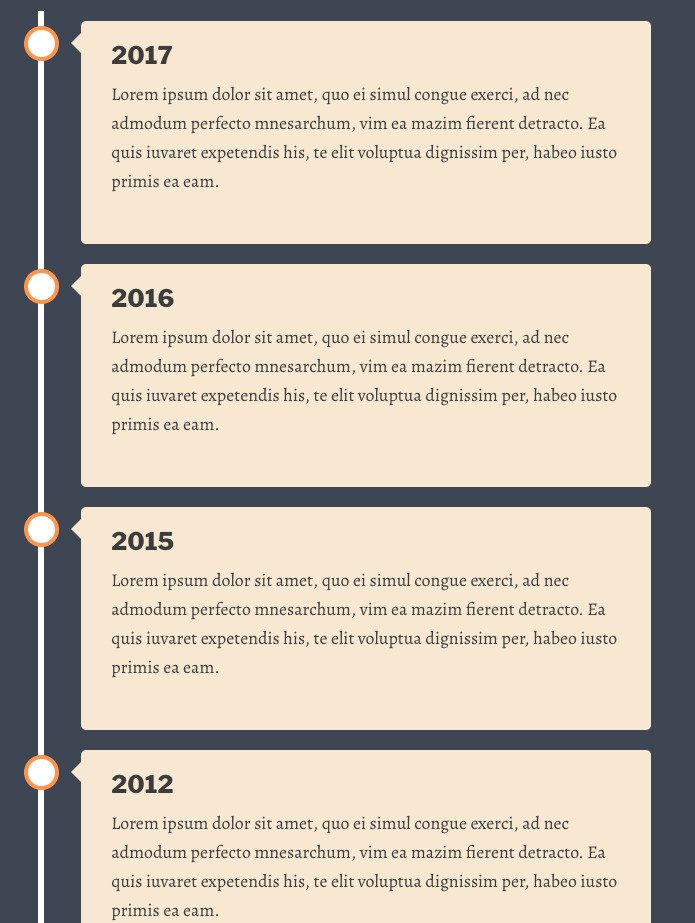
That’s it! The timeline in your page should now be responsive on tablet and mobile devices.
That’s all there is to creating a responsive CSS timeline in your Genesis theme. If you have any queries or comments, let me know in the comments below.