

When it comes to creating a grid layout in your Genesis child theme, your options include Flexbox and Column Classes.
For example, if you want to display a blog with a grid layout, you can either install the Genesis Grid Loop plugin by Bill Erickson, or use the following code snippet in your functions.php.
Then, add the following code to your css file.
.blog .entry {

    padding: 35px 40px;

}
However, with the innovative CSS Grid Layout, building complex CSS layout has become easier than ever.
In fact, if you’re planing to develop a custom Genesis theme based on complex gird layout, you want to give Sridhar Katakam’s Genesis Starter 2.3.0 a try as it has built-in support for CSS Grid Layout.
What is CSS Grid Layout all about?
It’s a CSS Layout method that is designed for the two dimensional layout of items on a webpage or within an application. When you incorporate CSS Grid into your css file, you can split your web page into multiple grids with rows and columns. Chris Coyier says CSS Grid (coupled with Flexbox) is one of the five huge CSS milestones in the web design history.
There are many great sources to learn more about CSS Grid Layout. However, I’d like to recommend the following ones:
- Playing with CSS Grids
- The CSS Grid Advantage: Front-End Design Beyond Flexbox
- A Complete Guide to Grid
Moreover, if you want to learn how to customize Genesis Header with CSS Grid Layout, don’t miss this tutorial by Victor M. Font Jr.
Thanks to CSS Grid Layout, front-end design is finally making print-like design easier to achieve.
Creating Posts Grid in Genesis Using CSS Grid
Recently, Sridhar Katakam wrote a tutorial on creating posts grid in Genesis using CSS Grid Layout.
Basically, it’s a custom template that you could apply to your front-page.php, archive.php or pretty much any pages where you want to display blog posts in beautiful fluid grid layout.
How is it any different from grid layout using Genesis Column Classes, you ask?
Well, for starters, it lets you manipulate the layout design of your page in much easier ways, simply by changing values in CSS properties. Here’s what a sample CSS Grid code snippet look like:
.articles {

display: grid;

grid-gap: 40px;

grid-template-columns: 1fr 1fr 1fr;

}
In the above example, we used display:grid to apply CSS grid layout to our container articles. Then we use grid-gap:40px to define the gutter or gap between the rows and columns. The most important thing, however, is the grid-template-columns property where you can add value based on how many columns you want to create. In this example, we want to create three columns, and therefore, we used 1fr 1fr 1fr or repeat(3, 1fr).
You might be wondering what an fr unit is. It’s actually a fractional unit much like px, em, rem. When we apply a fr unit, it essentially uses the available spaces within a parent container. Therefore, you needn’t even calculate anything here.
Here’s a scenario: Let’s say the total available width within a parent container is 1200px. If we apply the above css grid property, then it would allocate 400px to each child unit residing inside the container.
If you want four columns, you can change the value to 1fr 1fr 1fr 1fr or repeat(4, 1fr). In this case, each child unit will get 300px each. Please, note that you can also assign a fixed value to one of children, and split the rest of among the rest. Here’s an example:
grid-template-columns: 600px 2fr 1fr
In this case, the second and third unit will get 400px and 200px respectively.
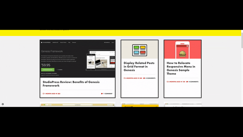
Here’s a GIF to see it in action.

Let’s Create a Custom Template for CSS Grid in Genesis
Step #1: Create a new file in your child theme. Name it loop-archive.php
Add the following code to it
Step #2: Create two more files in your child theme folder and name them home.php and archive.php.
Add the following code inside home.php and archive.php.
Step #3: Add the following code in your style.css file or any other external css file.
If your front page is already displaying your latest posts, you should see the blog posts in CSS Grid Layout. You can change the number of posts you want to display at Settings > Reading.
A Few Things about the Above Code
In Step #1, at line 46, you can add genesis_do_post_content below genesis_do_post_title if you want to display content as well.
Similarly, if you want to edit post info, add this code snippet to the file.
Hope you find this tutorial useful.
Needless to say, CSS Grid Layout is ultra responsive.